Tem's
- Client
- Tem's United
- Year
- 2025
- Role
- Product design
- Built with
- Figma
The problem
A logistics app has two people in it who want opposite things. A sender wants a price, a pickup and to know where their parcel is. A rider wants work, a route, and to get paid for it. Both of them were going into one product.
Built naively that becomes an app full of screens that half the users should never see, and a navigation that has to apologise for itself on every tab.
Pick a side first
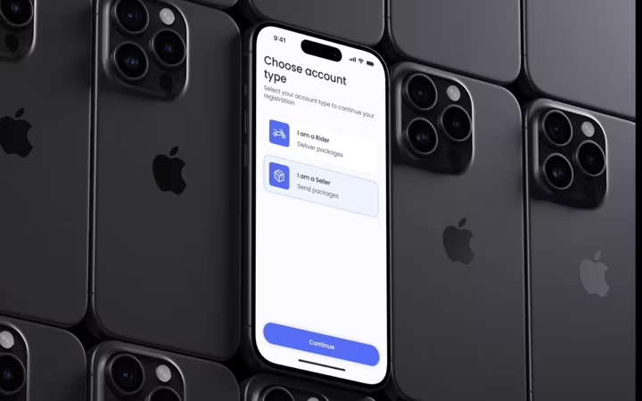
The screen straight after the splash asks which one you are, because almost nothing past that point is shared. Deciding it once, at the front, is what keeps the rest of the app from asking again on every screen, and it means neither side ever has to be told a feature is not for them.
Booking, in three short steps
Sending something is the thing a sender came to do, so it is the shortest path in the app. It is split into three screens rather than one long form: what you are sending, the details of it, then the vehicle.
Three short screens beat one long one here for a specific reason. Somebody booking a delivery is usually standing over the parcel with one hand free. A screen that asks four things can be answered standing up. A form that asks twenty cannot.
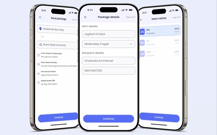
Each step ends in one button, always in the same place, so the flow can be finished without reading the screen after the first time.
Money is its own place
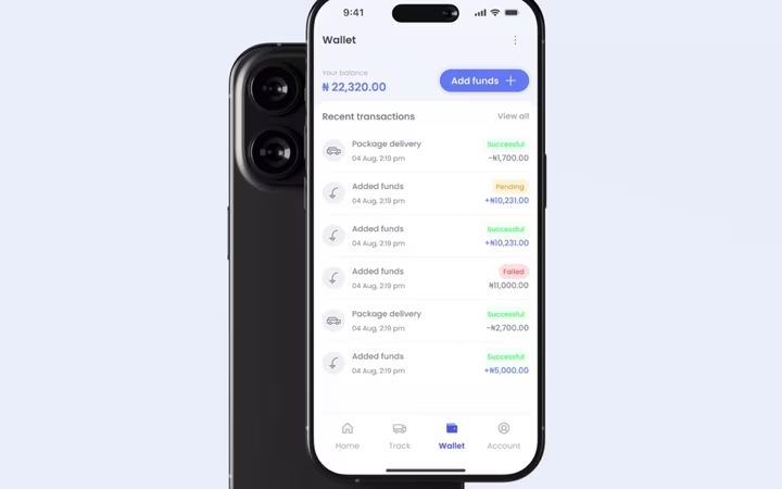
Payments live in a wallet rather than being attached to each delivery. A sender tops up once and stops thinking about it, and a rider sees what has come in and when. The transaction list is the same component for both, reading credits for one and earnings for the other.
Two dashboards, one system
From the account choice onward it is effectively two products, but they are built from the same parts: the same cards, the same list rows, the same buttons in the same positions. That is the foundation the brief asked for, and it is what makes a third screen cheap rather than a redesign.
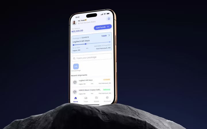
Result
An end-to-end experience mapped for both sides, a booking flow short enough to finish standing up, and a visual system underneath it built to be added to rather than redrawn every time a screen is needed.