
The Car Guys
- Client
- The Car Guys Inc
- Year
- 2026
- Role
- Design and build
- Built with
- Figma, Webflow
The problem
The Car Guys had just bought the domain. There was no site, no pages, and nothing anyone could fill in.
The business does three different things, and they are not variations of each other. Someone can buy or lease a new car, sell the car they already have, or hand back a lease early, and all of it happens without a dealership visit. Each one needs different information from a different kind of person, and each one ends in an application that a human being has to read. So the site could not be a brochure with a contact form at the bottom. It had to carry three separate services and be ready to take real applications the day it went up.
The waitlist, first
A domain with nothing on it is a month of people arriving and leaving. Rather than wait for the real site, I built them a coming soon page and put it up straight away.
It asks five things: first name, last name, email, phone, and a message. The message box matters more than it looks. Someone who is mid-lease and wants out will say so there, and that is a warmer lead than a name on a list. Three chips above it name what the business actually does, lease buyouts, auto brokering, no dealer markup, so a visitor knows whether they are in the right place before they type anything.
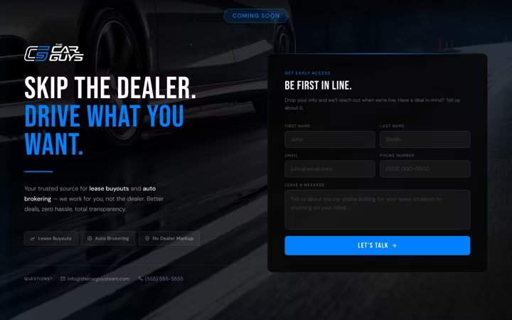
Drawn at 1920, 1440 and 425, so it was responsive before the site it was standing in for.
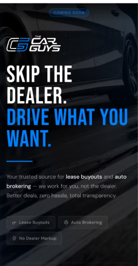
Drawn before it was built
Every page was wireframed in Figma first, in grey, with no photography and no brand colour. That is deliberate. A dark hero with a car in it will sell almost any layout to almost anyone, and the point of this stage was to argue about the order of the sections and the length of the forms while those were still cheap to change.
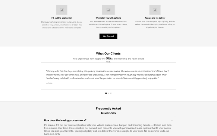
Eleven layouts came out of it, seven for desktop and four for phones. The application was drawn at this stage too, which is how the length of it became a design question rather than something discovered at the end.
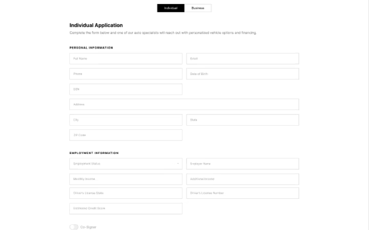
The site
Built in Webflow off those wireframes. Four page types: the home page, and one for each service.
Every service page is the same shape. A headline that says what you can do, one button, then How It Works as three steps, then the form. Someone who lands on Sell Your Car from a search reads the same structure as someone who came through the home page, so the site only has to be learned once.
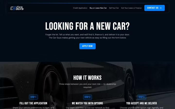
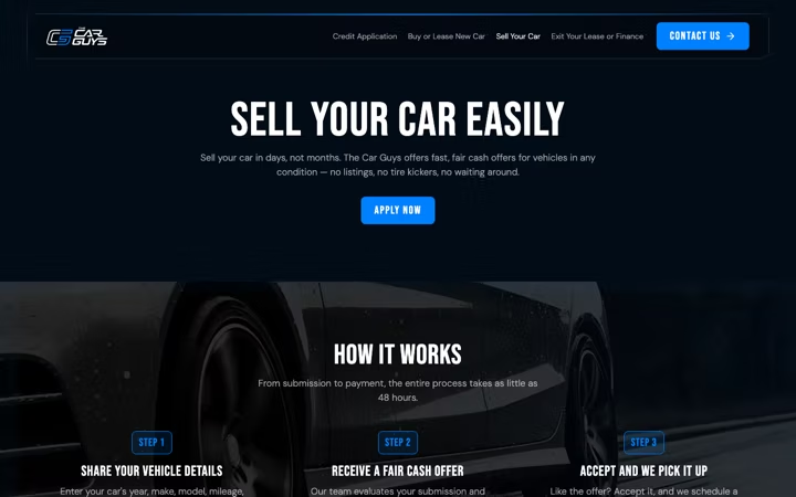

The FAQ answers were written from the service copy rather than invented, so the page answers its own questions instead of contradicting itself further down.
It holds at every width
Responsive the whole way down, not just below one breakpoint.

The navigation collapses to a menu at tablet width. On a phone the three step rows stack, and the two column form fields become one column rather than shrinking to something nobody can tap.

The application
This is where most of the work went.
The form we were working from, an existing application from another company in the same business, ran to 43 fields across three tabs. Eleven about the business, fifteen about the personal guarantor, and seventeen more about that guarantor’s employment, ending in a signature. Everyone answered all of it. A sole trader with no guarantor still filled in three tabs of guarantor questions, and a first tab that asks for a Tax ID is a strange thing to show someone who just wants to lease a car.
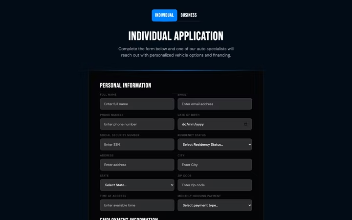
So it became two applications, not one. A person gets asked what a person can answer. A business gets asked about the business. Both sit on a single page instead of three tabs, because three tabs hide how much is left and a page does not.
The co-signer moved behind a toggle. Off by default, twenty one fields that only exist for the people who have one. That single decision is most of the difference between 43 and 22.
Result
A business now fills 22 fields instead of 43, and a person fills 29 without ever seeing a question about a guarantor they do not have. The site is live and covers all three, and the waitlist was up taking messages the whole time it was being built.