Altabrio
- Client
- Altabrio
- Year
- 2025
- Role
- Product design
- Built with
- Figma
The problem
Altabrio was weeks from launching a training product, which is the worst moment to discover that the navigation does not hold. Everything was built. What it needed was not more features, it was to be legible to somebody opening it for the first time.
A training product also has a particular problem: it generates a great deal of data and almost none of it is interesting on its own. A number is only useful next to the thing it is supposed to be, and a screen that shows forty numbers with equal weight is a screen nobody reads twice.
The way in
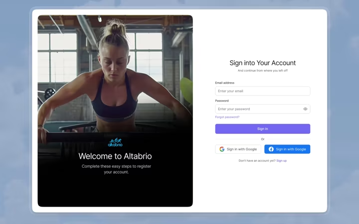
The first thing anyone meets is the sign in, so it does the introducing. What the product is sits beside the form rather than on a page before it, so nobody has to read a pitch to reach their account, and somebody arriving from an ad still learns what they signed up for.
Setting up is part of the product
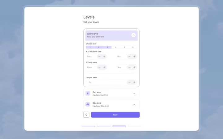
An adaptive training plan is worthless without the athlete’s own numbers in it, so the setup asks for them. It is a sequence of short steps with a progress bar rather than one long form, because someone who has just signed up has not yet decided this is worth twenty minutes.
The dashboard answers one question
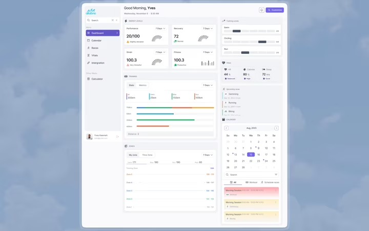
The layout puts the few numbers that answer “how am I doing” in front, grouped rather than spread, and keeps everything else one move away instead of on the same screen competing. The greeting and the date are there because a training app is opened daily and the useful frame is today, not all time.
The same system, four ways
The rest of the product is calendar, races and plans, and all three are the same components rearranged rather than three designs. A calendar of sessions, a table of races, a table of plans: one sidebar, one header, one set of table styles, one way a row behaves.
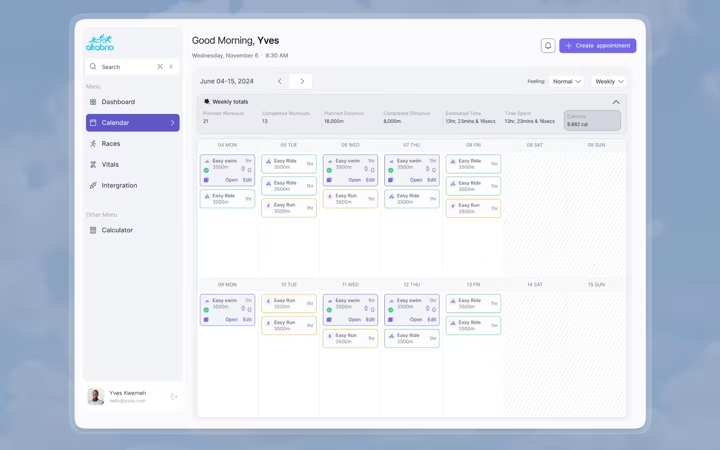
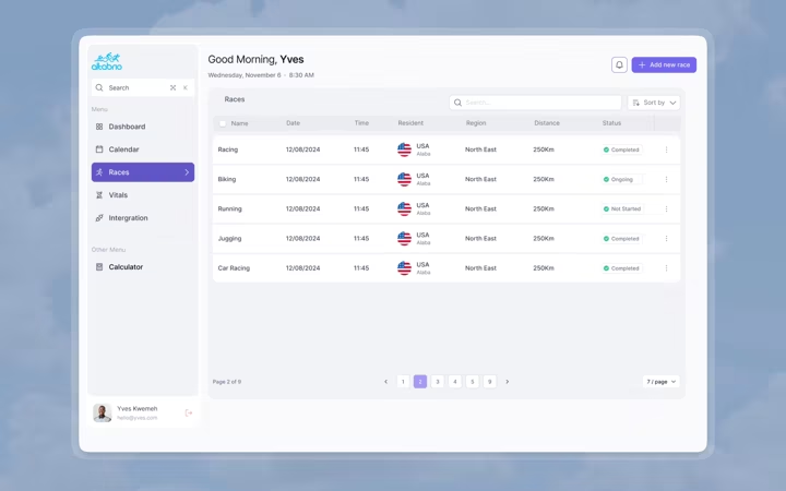
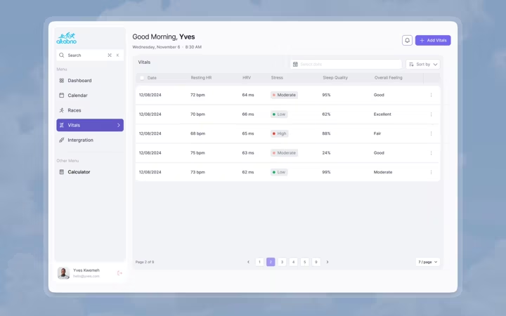
That is what made the deadline survivable. Once the system was settled, a new screen was an arrangement rather than a design, and the remaining weeks went on the screens that still needed thinking about.
Result
Navigation streamlined, the visual identity rebuilt, and a product that could go out on time and be understood by the people who signed up first.